Rethinking the Template: How We Helped Kotak Life Find Its Visual Voice
- Suriti Arora

- Jun 25, 2025
- 2 min read

Some design projects are bold and buzzy. Others quietly revolutionize how a brand shows up, every single day.
This is the story of the latter.
When Kotak Life asked us to redesign their communication templates, the brief was mission-critical.
Because when your decks, documents, and daily tools don’t reflect your brand, you’re losing clarity, identity, and connection.
Here’s how we fixed that.
The Challenge
Kotak Life’s existing templates weren’t doing them justice:
Visually too similar to Kotak Bank, causing confusion
Dark, heavy layouts that made content feel cluttered
A lack of visual hierarchy and consistency across teams
And most importantly, no sense of brand distinctiveness
In a highly competitive insurance market, they needed more than a cosmetic refresh. They needed design that clarified, elevated, and aligned.
The Idea: Strategy Meets Scalability
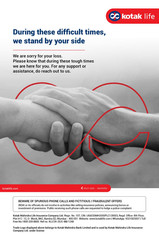
We designed a brand-new template system that was clean, confident, and unmistakably Kotak Life.

Here’s what we brought to the table:
✅ A distinct visual identity that finally set Kotak Life apart from its banking sibling
✅ Consistent design language across formats and teams
✅ Clear, breathable layouts with improved readability
✅ Use of secondary colours to reduce over-dependence on red/navy
✅ A system that’s cost-effective and scalable; built to last
And here’s the special ingredient: We embedded the Infinity loop, a powerful visual from Kotak Life’s logo, across the system. Not just as a decorative motif, but as a design anchor. It subtly reinforced the brand’s promise of lasting protection and trust, without shouting for attention.


What Changed: The Real-World Impact
This wasn’t just a design glow-up, it had measurable results.
+13% increase in click-through rates within just two months
Better brand recall and lead attribution, thanks to clear visual separation from Kotak Bank
Smoother internal adoption because teams finally had templates they wanted to use
And most importantly: Clearer, more confident communication from the brand, every day
What This Says About Design (and Us)
Templates may not always win awards. But they win trust. And for a brand like Kotak Life, trust is everything.
At Yellow Productions, we don’t just make things look better. We make them work smarter across departments, platforms, and even that one person who refuses to read the brand guidelines.
If your brand shows up in dozens of formats a day like decks, reports, campaign slides, then those formats need to be saying the right things. Visually, structurally, and emotionally.
Let’s build a design system that actually supports your brand.
(Not just decorates it.)


Comments